An introduction to seaborn(seaborn으로의 도입)
일단 seaborn으로 차근차근 그래프를 그려보자!
일단 필요한 seaborn라이브러리를 호출!
# Import seaborn
import seaborn as sns
%matplotlib inline # 그래프 출력 안됨문제 해결하기 위해
그리고 기본 테마를 설정해주자!
# Apply the default theme
sns.set_theme()
그 다음... seaborn에 내장된 tips데이터셋을 불러왔다!
# Load an example dataset
tips = sns.load_dataset("tips")
tips
음... 저녁 식사 데이터 같다!
이제 tips데이터 셋에서...
relplot을 이용해 그래프를 그려줄건데...
1. relplot은 scatterplot(산점도), lineplot(선그래프)의 상위 개념!
2. 기본값은 scatterplot!(kind="line"로 지정하면 선그래프)
3. 한 번에 여러개의 그래프를 그릴 수 있음!
을 참고하면 좋겠다!
그러면...
x는 total_bill
y는 tip
col은 time(범주형인 time에 따라 그래프를 분할)
hue는 smoker(smoker의 색을 다르게 해준다!)
style은 smoker(smoker의 모양을 다르게 해준다!)
이렇게 조건을 걸어놓고 코드를 써주면...
# Create a visualization
sns.relplot(
    data=tips,
    x="total_bill", y="tip", col="time",
    hue="smoker", style="smoker", size="size",
)
아래 처럼 이렇게 예쁜 시각화가 완성!

음... 대체로 전체 계산서 금액과 팁이 같이 증가하는 형태를 보인다!
선 그래프로도 궁금해서 그려봤더니..
# Create a visualization
sns.relplot(
    data=tips,
    x="total_bill", y="tip", col="time",
    hue="smoker", style="smoker", size="size",
    kind='line'
    )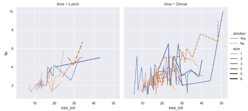
오우 쉣...이다!
참조 사이트
https://seaborn.pydata.org/tutorial/introduction.html
An introduction to seaborn — seaborn 0.12.2 documentation
An introduction to seaborn Seaborn is a library for making statistical graphics in Python. It builds on top of matplotlib and integrates closely with pandas data structures. Seaborn helps you explore and understand your data. Its plotting functions operate
seaborn.pydata.org
'재미로 하는 코딩' 카테고리의 다른 글
| 시각화 뽀개기3 (0) | 2023.02.05 |
|---|---|
| 시각화 뽀개기2 (0) | 2023.02.04 |
| 네이버 영화별 평점 수집해보기 (0) | 2023.01.15 |
| 네이버 웹 스크래핑 해보기 (0) | 2023.01.10 |
| 로또가 당첨되려면 몇 번 뽑아야할까? (0) | 2023.01.09 |


댓글